
Documentation
Bento
Translated from the Portuguese original. Labels from the CLI and the admin panel stay in Portuguese, as you will see them.
Asymmetric grid with a floating dock — modern, product-oriented.
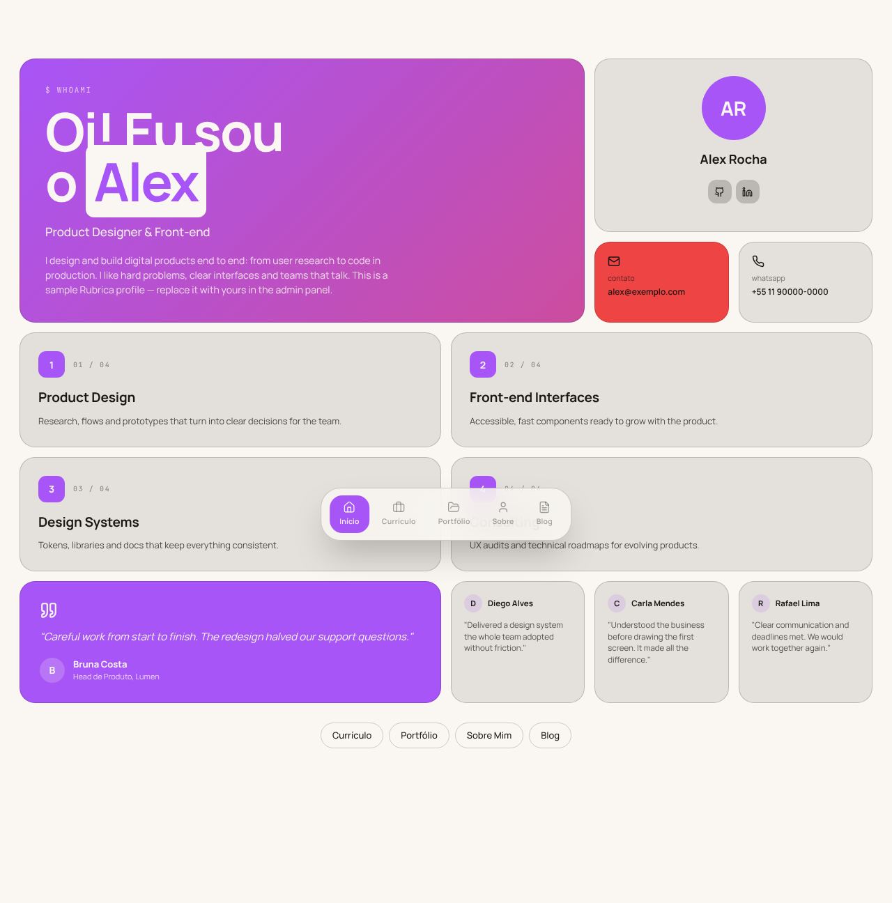
Screenshots use the Editorial Cream palette. See the layout in every palette in Color schemes.
Concept
Each page is a mosaic of cards (a "bento box") built on a 12-column grid with 14px gaps. The cards have very rounded corners (22px), a thin border and a background lightly tinted by the text color — no shadows, to keep the mosaic clean. Navigation leaves the top and becomes a floating dock at the bottom, as in an operating system.
The primary becomes the background of the most important cards (with text in the background color), the accent marks secondary cards, and the Home hero combines both in a gradient. Titles are large and tight (weight 700, 44–76px), and each page opens with a mono label in command style: $ whoami, $ cat resume.md, $ ls -la projects/, $ cat about.md, $ less blog/.
- Recommended fonts: Manrope (main) and JetBrains Mono (mono).
- Template files:
Layout.tsx,FloatingDock.tsxand the 5 pages inpages/.
Global structure
- Floating dock, fixed and centered at the bottom: a translucent capsule with background blur and 5 items (icon + label) and, separated by a thin rule, the light/dark mode icon (only with the toggle on). The active item sits in a primary block. On mobile, the items get narrower so the dock fits in 360px.
- Pages reserve space at the bottom so the dock does not cover the content.
Pages
Home
- Hero across 8 columns × 2 rows with a primary → accent gradient:
$ whoami → Nome, the value statement (home.hero.headline), the role and two buttons, "Ver cases" (See cases) and "Fale comigo" (Talk to me, opens the contact form). - A profile card with an initials avatar and GitHub/LinkedIn buttons.
- Contact cards (email on the accent, WhatsApp) depending on each one's visibility.
- Highlight numbers right below the hero: up to 4 cards from
home_metrics(admin → Home → Números), the first on the primary. The strip disappears when there are no numbers. - "Cases em destaque" (Featured cases): the first 3 projects with a case page, each with an image, the case's first metric and the
$ cat case.mdlink. - Services in a 2×2 grid numbered "01 / 04"; testimonials with the first one large on the primary and the next ones small.
- A footer with pill shortcuts to the other pages.
Resume
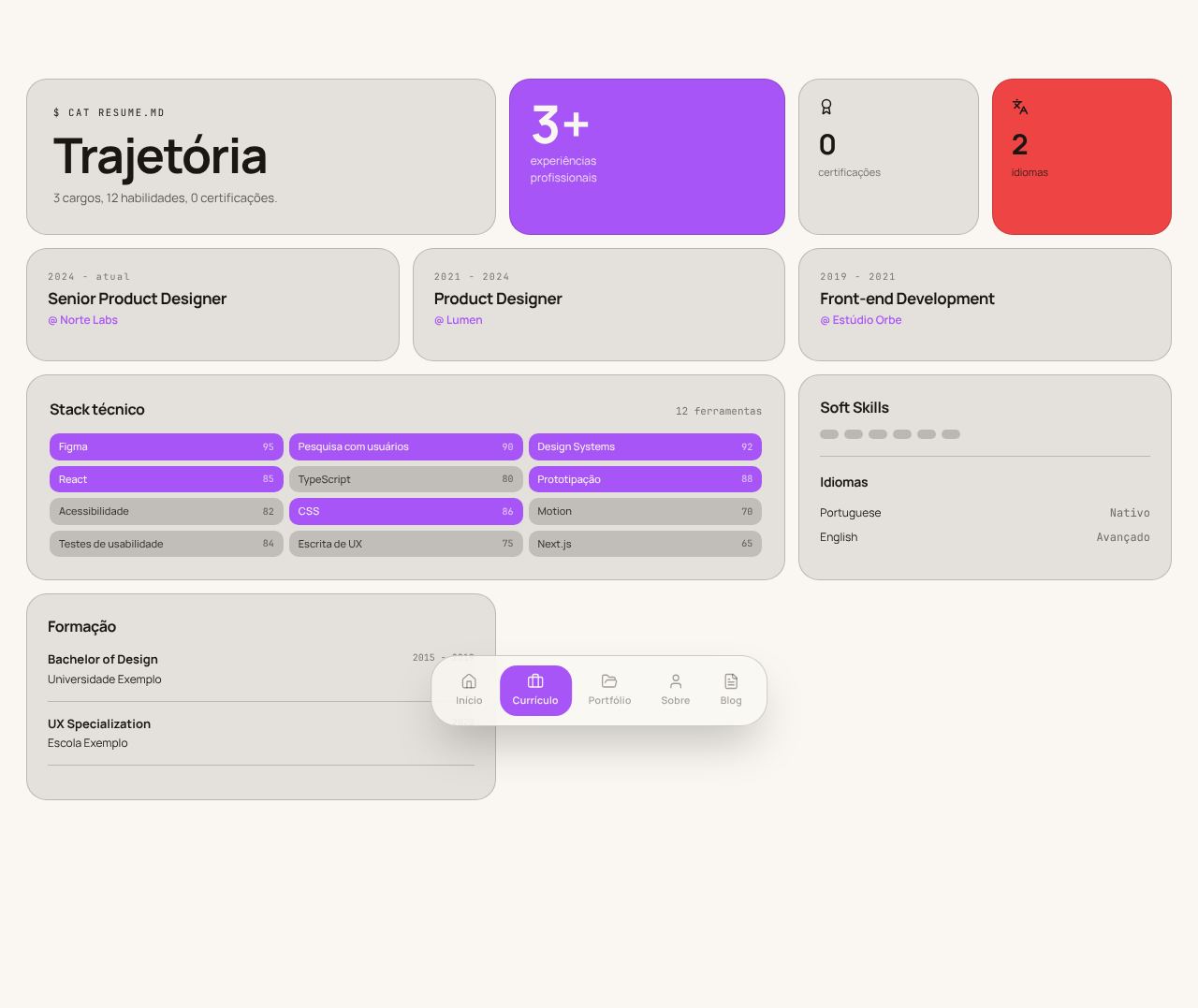
- A row of summary cards: "Trajetória" (Career path) with the summary (first paragraph of "sobre") and the "Baixar CV (PDF)" (Download CV) button, next to the experience count as a large number on the primary, certifications and languages.
- Highlight numbers (the same as on the home) right below.
- Experience in 3 columns with up to 3 bullets each; older ones sit behind "ver experiências anteriores" (see earlier experience).
- "Stack técnico" (Tech stack): skills as chips grouped by category (the "Grupo" field in the admin), the first group on the primary. No numeric levels.
- Soft skills and languages beside it; education, courses and volunteering in the last row.
Portfolio
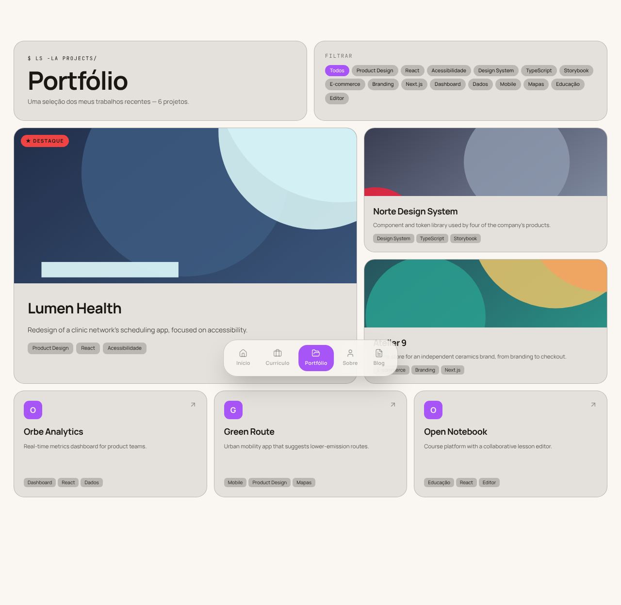
- Category filter as pills ("Todos" (All) + the projects' categories). With no category registered, the filter disappears.
- Hierarchical grid: the 1st project becomes the highlight (7 columns × 2 rows, large image, "★ Destaque" badge), the 2nd and 3rd are medium, and the rest become compact cards with the initial.
- Each card shows the case's first metric and a single action:
$ cat case.mdwhen there is a case, otherwise the project link.
About
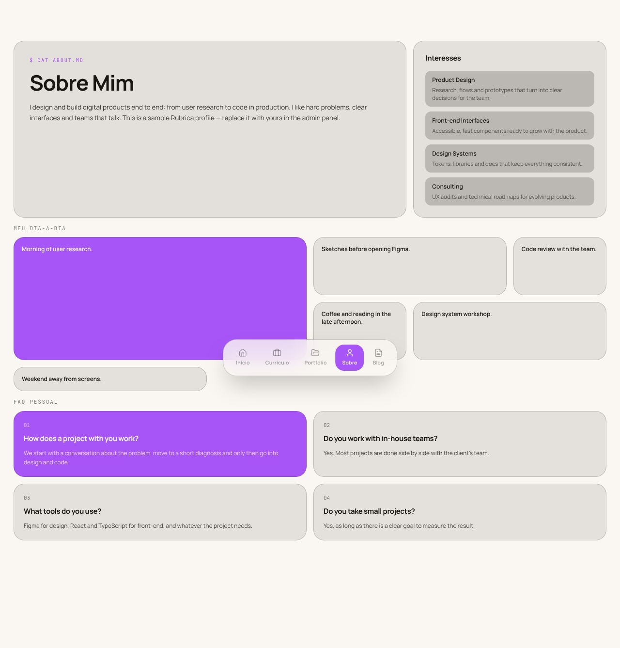
- A "Sobre Mim" (About me) card opening with the "Resumo profissional" (Professional summary) (the "sobre" text, with the numbers highlighted) and, beside it, "Interesses" (Interests), reusing the Home services.
- "Como eu trabalho" (How I work): the work principles (admin → Home → Princípios) in numbered cards, the first on the primary.
- "Fora do trabalho" (Outside work): the personal text, after the professional part.
- "Meu dia-a-dia" (My day-to-day) as a mosaic of 6 columns with varied sizes, the first item larger and on the primary.
- FAQ in a numbered 2×2 grid, the first question on the primary.
Blog
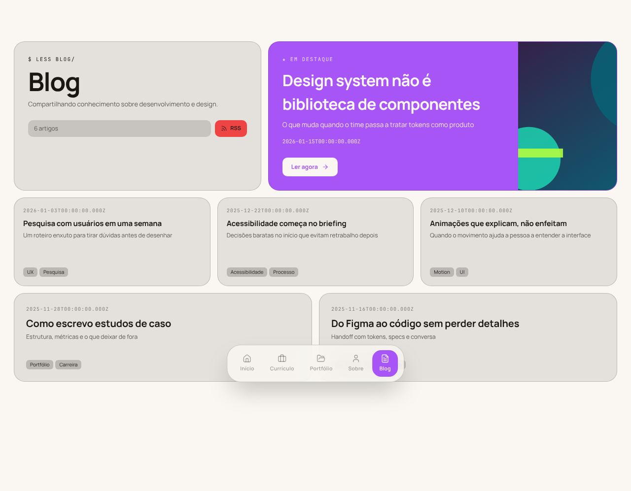
- A title card with the article count and an "RSS" badge.
- The featured post in a wide primary card, with the image on the right and "Ler agora" (Read now, opens the post).
- The other posts in a 6-column mosaic with varied sizes (two of them larger).
Known limitations
- The grids are fixed (12, 6, 3 and 2 columns) with no breakpoints: on mobile the columns shrink, and the 76px title can overflow.
- Text on the accent color (email card, languages, RSS, "Destaque" badge) turns black or white depending on the accent's lightness (
--bento-on-accent, defined inLayout.tsx), so it stays readable in both modes. It needs a browser with relative color syntax (oklch(from …)). - Only the featured post has a link; the project cards and the other post cards are not clickable yet.